Jewelry photo editing is super important when selling online. When people browse a jewelry store they can’t touch, feel or examine the products closely. They only have a photo to decide if they want to buy. This one photo has to do the job of a salesperson, store display and magnifying glass at once. If the photo isn’t edited right even if its only a little off the sale might not happen.
Jewelry sellers on sites like Amazon, Etsy and Shopify spend a lot of time finding products.. Sometimes small mistakes in photo editing can make buyers not trust the product. For example a ring might look like its made of plastic a necklace might have a color or a bracelet might have a strange shadow. These mistakes aren’t on purpose. They can make buyers lose trust.. When shopping online buyers can’t check things out for themselves.
This article will go over mistakes, in jewelry photo editing that can hurt sales. We’ll also talk about why they happen and how to avoid them. If you’re editing your photos or working with a professional team these tips will help you make clear real-looking images that build trust and get more sales.
Why Jewelry Retouching Is Harder Than It Looks
Photographing and editing a sofa or a t-shirt is relatively forgiving. Jewelry is a different challenge altogether. It’s small, it’s reflective, and it’s made of materials that behave unpredictably under light .Polished gold catches every stray reflection, diamonds scatter light in dozens of directions, and gemstones shift color depending on the angle of the shot.
Because the subject is so tiny, every retouching decision is magnified. A sharpening slider pushed too far isn’t a minor issue on a jewelry photo the way it might be on a landscape shot; it turns a diamond into a jagged, artificial-looking blob. A shadow that’s a few shades too dark makes an elegant pendant look like it’s sitting in a hole rather than resting naturally on a surface.
This is also why jewelry photography and retouching sit in their own specialized category. It’s not just about making an image “look nice.” It’s about representing the product with enough accuracy that a customer feels confident clicking “buy,” while still making the piece look as attractive as it does in person or better.
With that context in mind, let’s look at the mistakes that come up again and again, and cost sellers sales without them even realizing it.
1. Over-Editing and Over-Sharpening
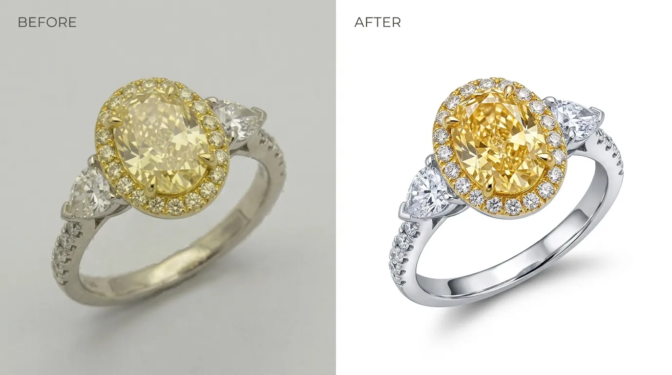
This is probably the single most common mistake in jewelry retouching, and ironically it usually comes from good intentions. Editors want the piece to look crisp, detailed, and eye-catching, so they push sharpening, clarity, and contrast higher and higher.
The problem is that jewelry has a very low tolerance for this. Push sharpening too far and the metal starts to look grainy or artificial. Push clarity too far and gemstones lose their natural glassy quality, taking on a strange, almost plastic sheen. Customers might not be able to name what’s wrong, but they can sense that something looks “off,” and that hesitation is often enough to make them close the tab.
The fix is restraint. Sharpening should be applied selectively to the edges of a diamond’s facets, or the crisp line where metal meets a prong. Rather than blanketed across the entire image. Zooming in to 200% or more after editing is a simple habit that catches most over-sharpening problems before the image goes live. If an editor finds themselves squinting and asking “does this look real?”, that’s usually the moment to dial the effect back.
2. Inaccurate Color Correction
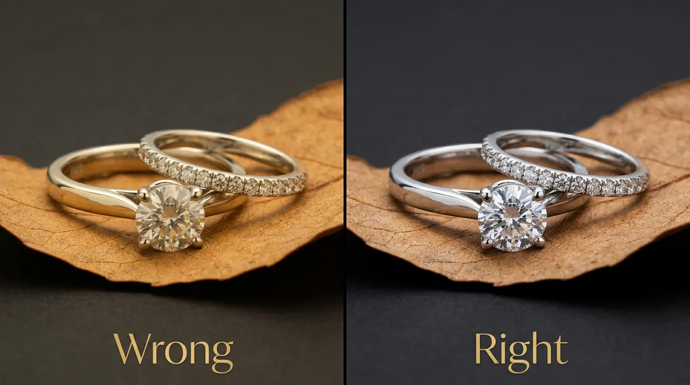
Color accuracy is where a lot of returns quietly originate. A ring photographed under warm indoor lighting might come out with a yellowish tint on what is actually a bright white gold or platinum band. A blue sapphire might photograph closer to purple. A rose gold piece might look more orange than pink.
When the photo doesn’t match the product, two things happen. First, some customers simply don’t buy, because the color in the image doesn’t appeal to them the way the real piece would. Second, and more damaging. Some customers do buy, and then request a return or leave a negative review when the item arrives looking different from what they saw online. Both outcomes hurt the business, but the second one is worse because it also damages the seller’s reputation and rating.
Getting this right starts before editing even begins. Shooting with a proper white balance setting, or better yet using a gray card or color checker during the shoot, gives the editor an accurate reference point to correct against later. During editing, color correction tools should be used to match the product’s real-world tone as closely as possible, not to make it more “dramatic” or saturated than it actually is. A little bit of restraint here protects both the sale and the seller’s credibility.
3. Ignoring Dust, Scratches, and Fingerprints
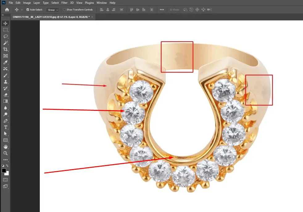
Jewelry photography happens up close, often with macro lenses, which means every imperfection on the surface of the product becomes highly visible. A tiny speck of dust on a diamond, a faint scratch on a gold band, or a smudged fingerprint on a polished pendant can all show up clearly in the final image, even if they’re invisible to the naked eye in person.
These small flaws matter more for jewelry than almost any other product category because jewelry is sold on the promise of perfection and luxury. A necklace with a visible smudge doesn’t just look messy, it subtly signals “not premium,” even if the actual piece is flawless.
The fix is patience and attention to detail during retouching. Tools like the Clone Stamp or Healing Brush in Photoshop can remove small blemishes without disturbing the surrounding texture. For more delicate cleanup, especially around gemstones and engraved details. Frequency separation techniques allow editors to smooth out surface flaws while preserving fine texture underneath. The habit that catches most of these issues is simple: zoom into the image at 200–300% before calling it finished, and scan every inch of the product methodically rather than just glancing at the whole picture.
4. Using the Wrong Background
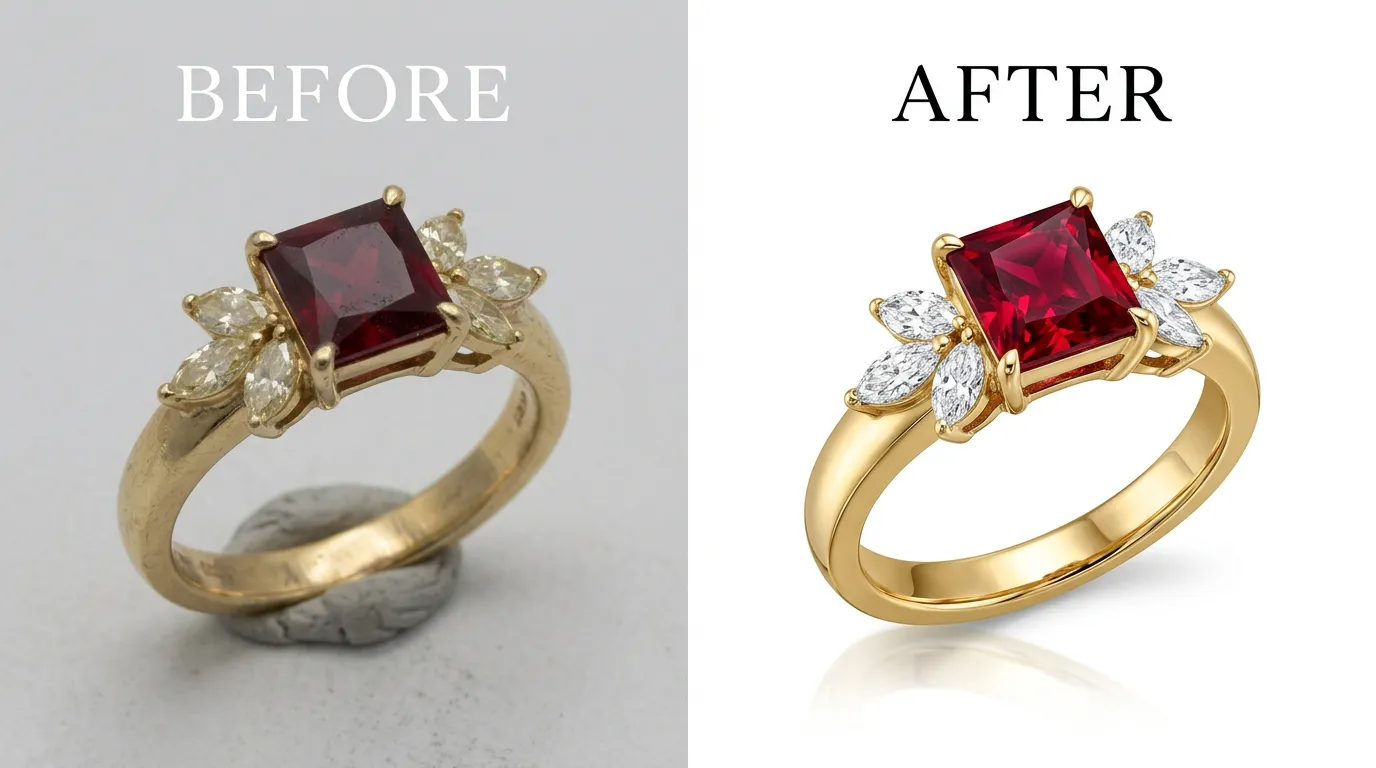
Backgrounds seem like a minor detail, but they carry real weight in jewelry marketing. A cluttered, colorful, or inconsistent background pulls attention away from the actual product, and on top of that, most major marketplaces have strict background requirements that sellers are expected to follow.
Amazon, for example, generally requires a pure white background (RGB 255, 255, 255) for main product images. Ignore this and a listing can be flagged, suppressed, or simply look unprofessional next to competitors who followed the guidelines. On platforms like Shopify or a custom website, a transparent PNG background often works better, since it gives the seller flexibility to place the product on branded backgrounds elsewhere on the site.
Getting a clean, precise background isn’t always simple with jewelry, because fine details like chain links, prongs, and cutouts require careful, accurate cutting a rough or clumsy background removal leaves harsh edges or a faint outline that instantly looks amateur. This is one of the reasons many sellers choose to outsource background removal to retouching specialists rather than trying to do it in a rush themselves.
5. Inconsistent Shadows and Reflections
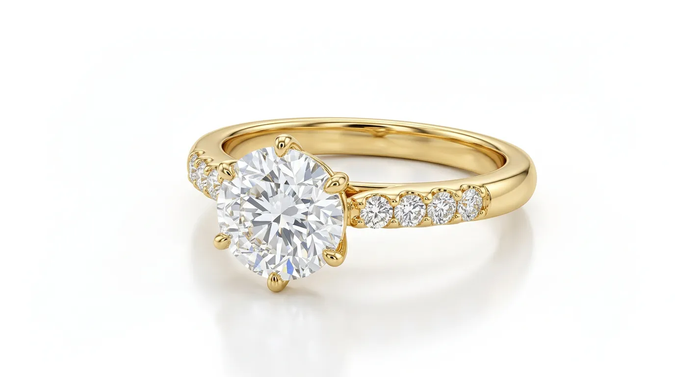
Shadows do more work in a product photo than most sellers realize. A well-placed, soft shadow grounds the product, making it look like it’s actually resting on a surface rather than floating in space. Skip the shadow entirely, or add one that’s too harsh, too dark, or in the wrong direction, and the image starts to feel artificial, almost like a cut-and-paste job.
The opposite mistake also happens: editors trying to make an image feel more premium sometimes add heavy, dramatic reflections underneath a ring or bracelet, and overdo it to the point where the reflection looks more like a mirror trick than a natural effect.
Consistency across an entire product line matters just as much as getting one image right. If one photo has a soft shadow angled to the left and the next has a hard shadow angled to the right, the whole catalog starts to feel disjointed, even if a customer can’t quite articulate why. The goal is a shadow and reflection style that feels natural, is used consistently across the whole product line, and stays subtle enough that it enhances the product without becoming a distraction in itself.
6. Losing Detail in Gemstones
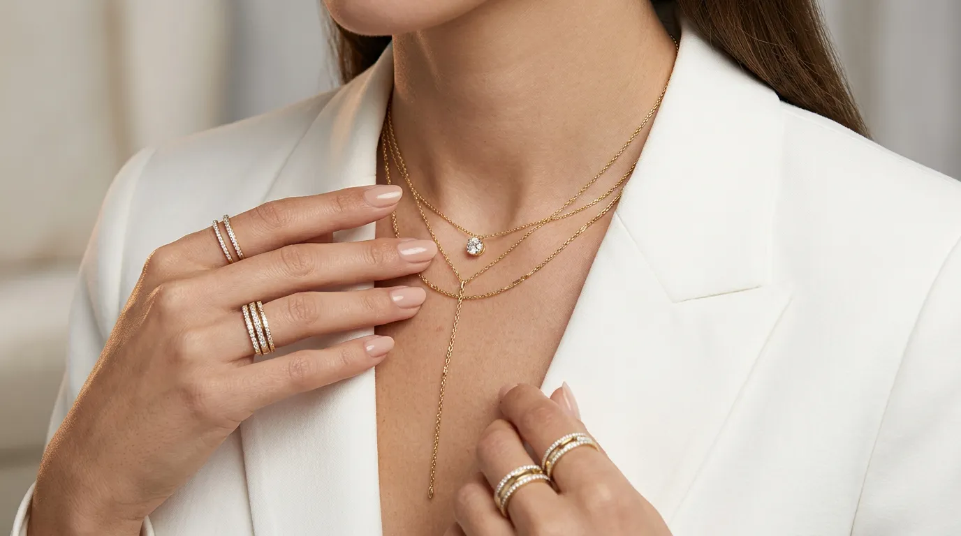
Gemstones are the heart of most jewelry pieces, and they’re also one of the easiest details to accidentally ruin during editing. Noise reduction, applied too aggressively, smooths out the tiny facets and internal sparkle that make a diamond or gemstone look alive. The result is a stone that looks flat, dull, or oddly plastic, the opposite of what a customer expects from a “sparkling” piece of jewelry.
This mistake is especially costly because gemstones are often the main selling point of a piece. A ring with a beautifully cut diamond that photographs as a dull gray circle is going to underperform, no matter how good the metal work looks.
Avoiding this comes down to precision rather than blanket edits. Localized sharpening applied specifically to the facets of a stone, combined with subtle dodge and burn work to enhance highlights and shadows within the gem, brings back that sense of depth and sparkle. Editing non-destructively, using layer masks rather than flattening changes directly onto the image, also gives editors the flexibility to fine-tune gemstone detail without affecting the rest of the photo.
7. Treating Every Metal the Same Way
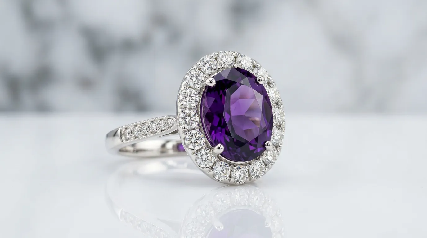
Gold, silver, rose gold, and platinum all reflect and absorb light differently, and yet a surprisingly common mistake is applying the exact same editing preset to every piece regardless of metal type. A set of curves and contrast adjustments that makes yellow gold look warm and rich might make platinum look dull and gray, or push rose gold into an unnatural orange tone.
This isn’t just a visual inconsistency, it actively misrepresents the product. A customer expecting a cool, silvery platinum band shouldn’t receive an image that makes it look warm-toned, because that mismatch between expectation and reality is exactly the kind of thing that leads to returns and complaints.
The solution is to treat each metal type as its own editing case. Curves, contrast, and selective color adjustments should be tailored to the reflective properties of the specific metal in the photo, rather than relying on a single one-size-fits-all preset for the entire catalog. It takes a bit more time upfront, but it protects both the accuracy of the listing and the customer’s trust.
8. Cropping and Framing Errors
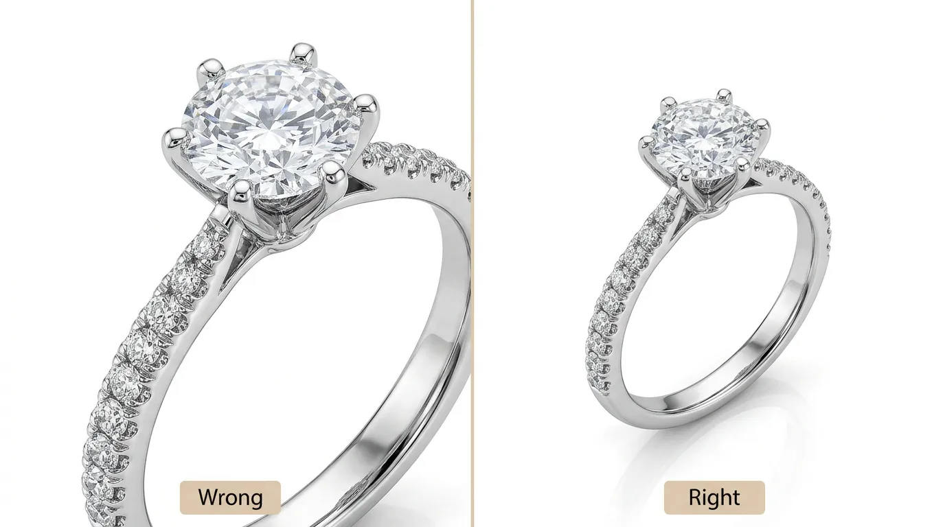
How a product is framed within the image affects both its visual appeal and how well it performs on marketplaces with strict image requirements. Crop too tightly and important details. A clasp, an engraving, the full curve of a bracelet can get cut off. Leave too much empty space around the product and the piece looks small, insignificant, and harder to appreciate.
Marketplaces like Amazon also have specific image dimension requirements, commonly around 1000×1000 pixels or larger, partly to support their zoom feature. A poorly framed image doesn’t just look worse; it can also fail to meet technical requirements and get rejected or flagged during listing review.
Following the rule of thirds or simple center alignment keeps images looking intentional and professional. Product photography and cropping should be planned together as much as possible, so that important details always have enough breathing room, and cropping is used to draw attention to a feature like a hero shot of a diamond’s cut rather than accidentally slicing off part of the design.
9. Low Resolution and Compression Artifacts
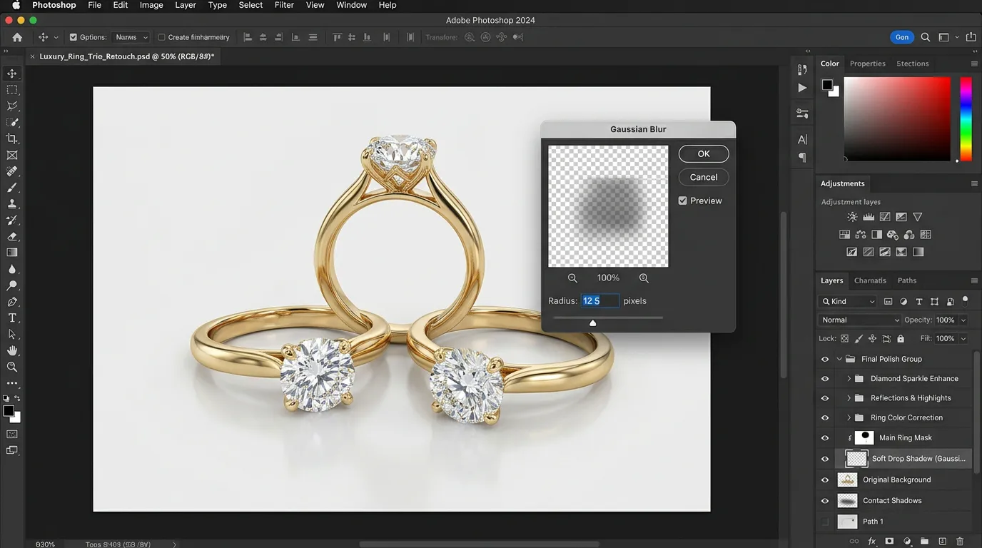
Online jewelry shoppers zoom in. It’s one of the most natural things to do when you’re evaluating a piece you can’t physically hold. Customers want to check the clarity of a stone, examine an engraving, or look closely at the finish of the metal. If the image is low resolution or heavily compressed, that zoom reveals pixelation, blurring, and blocky artifacts instead of the detail the customer is looking for.
This mistake often happens for a practical reason: sellers compress images aggressively to keep website load times fast, or export at low quality without realizing the impact on visual clarity. The trade-off, though, usually isn’t worth it. A slow-loading high-quality image will often still outperform a fast-loading blurry one, because trust and clarity drive conversions more than a few hundred milliseconds of load time.
The better approach is to export images at appropriately high quality JPEG at or near 100% quality for web use, PNG when transparency is needed, and 300 DPI for any print materials while using smart compression tools that reduce file size without visibly degrading the image. Most modern image optimization tools can shrink file size significantly while preserving the detail that matters for a zoomed-in jewelry shot.
10. Inconsistent Editing Across a Product Line
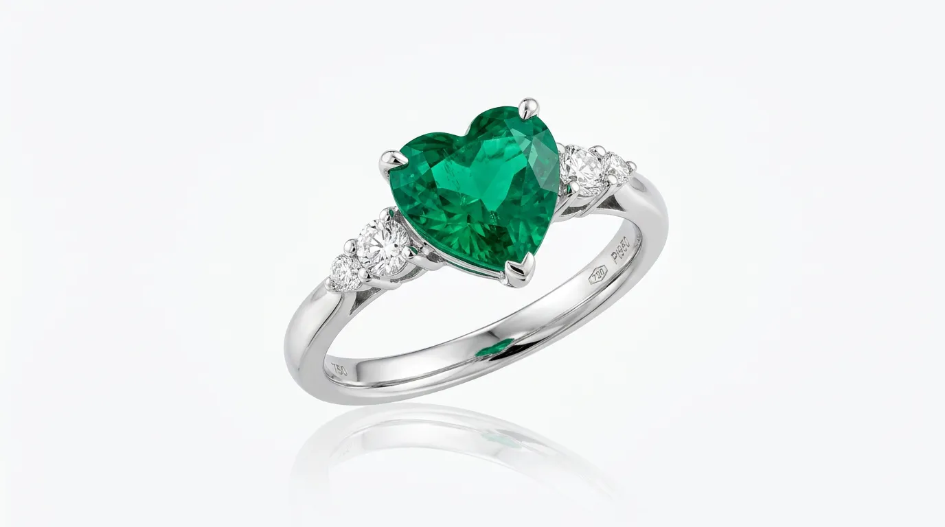
A single great photo is good. A cohesive, consistent product catalog is what actually builds a brand that customers trust and remember. When each product image in a line has different lighting, different color tones, or a different background style, the whole store starts to feel unprofessional and disorganized, even if each individual photo looks fine on its own.
This inconsistency often creeps in gradually. A batch of photos edited on a busy day looks slightly different from a batch edited a week later, or two different team members apply slightly different techniques without realizing it. Customers browsing a full collection notice these small differences even if they can’t explain exactly what feels wrong.
The fix is building repeatable systems rather than editing each photo from scratch. Creating custom presets or actions in Photoshop or Lightroom ensures the same base adjustments are applied consistently. Batch processing tools help maintain uniformity across dozens or hundreds of images at once. For teams or outsourced retouching partners, a simple internal style guide. Covering background color, shadow style, cropping ratio, and color correction approach. Keeps everyone aligned and keeps the final catalog looking like it belongs to one cohesive brand.
The Real Cost of These Mistakes
It’s worth pausing on why these small technical errors translate into real business losses. Online jewelry shopping already asks customers to take a leap of faith. They’re trusting a photo to represent a physical object accurately. Every one of the mistakes above chips away at that trust in a different way:
Over-editing and lost gemstone detail make the product look less premium than it is. Inaccurate colors and inconsistent metal treatment set up expectations. That the physical product won’t match, which drives returns and negative reviews. Poor backgrounds and framing make listings look unprofessional next to competitors. Low resolution images fail the “zoom test” that most serious jewelry shoppers instinctively run. And inconsistent editing across a catalog quietly undermines brand trust, even when no single photo is technically “bad.”
None of these mistakes are usually intentional. They happen because retouching jewelry well takes a specific kind of patience and technical precision that’s easy to underestimate. Until the return rate or the bounce rate on a listing tells the real story.
Building a Better Retouching Workflow
For sellers who edit their own product photos, a few habits go a long way toward avoiding these pitfalls:
Shoot with accurate white balance and, if possible, a color reference card. So color correction later has something reliable to work from. Zoom in during every editing pass, not just at the end, to catch dust, over-sharpening, and gemstone detail loss early. Build presets for backgrounds, shadows, and color grading so that every image in a collection follows the same visual language. And treat each metal type as its own editing case rather than relying on a universal preset.
For sellers managing large catalogs or scaling quickly. Outsourcing to a specialized jewelry retouching service often makes more sense than trying to handle everything in-house. Jewelry retouching is a genuine specialty within photo editing. It demands a level of precision around reflections, gemstone clarity. And metal tone that general-purpose editors don’t always have experience with. A team that retouches jewelry every day develops an eye for these specific issues. That’s hard to replicate without years of focused practice.
Frequently Asked Questions
What’s the best software for editing jewelry photos?
Adobe Photoshop remains the industry standard for detailed jewelry retouching. Especially for tasks like frequency separation, gemstone enhancement, and precise background removal. Lightroom and Capture One are also widely used, particularly for batch color correction and maintaining consistency across large product catalogs.
Can jewelry photos be edited on a phone?
Basic adjustments are possible with mobile apps like Lightroom Mobile or Snapseed. They can be useful for quick previews or social media content. For professional, marketplace-ready images, though, desktop software gives far more control over the fine detail work that jewelry retouching requires.
How long does professional jewelry retouching typically take?
A single high-quality retouch usually takes somewhere between 15 and 30 minutes per image. Depending on the complexity of the piece and how much detail work gemstone enhancement, dust removal, background cleanup is needed.
Why do jewelry photos need more retouching than other products?
Jewelry is small, highly reflective, and full of fine detail. Which means even minor flaws or editing errors become highly visible up close. Buyers also tend to zoom in more on jewelry listings than on other product categories. Which raises the bar for image clarity and accuracy even further.
Final Thoughts
Every one of the mistakes covered here is fixable, and none of them require expensive equipment. Just attention to detail and a workflow built around jewelry’s specific challenges. A ring, a necklace, or a bracelet deserves an image that reflects its actual beauty. Not one that’s been over-processed, inconsistently colored, or carelessly cropped.
For online sellers, the photo isn’t just marketing material. It’s the entire basis on which a customer decides to trust the purchase. Getting the retouching right, consistently, across every listing is one of the most direct ways to reduce returns. Build a stronger brand, and turn more browsers into buyers.
Struggling with inconsistent jewelry photos? Contact us for a free consultation, or Get a Free Quote today and see how professional retouching can transform your product listings.