Jewelry is one of the hardest product categories to photograph well. It’s small, it’s reflective, and it’s often made of materials that catch light in unpredictable ways. One wrong choice in the background can turn a beautiful piece into something that looks cheap, cluttered, or simply forgettable on a product page. That’s why choosing the right background for jewelry photography matters just as much as the lighting setup or the camera you use.
If you sell online, your background isn’t just a design choice. It affects how fast a shopper trusts your brand, how well your images convert into sales, and how consistent your store looks across dozens or hundreds of listings. A ring photographed on a busy, mismatched backdrop can look amateurish even if the piece itself is stunning.
In this guide, you’ll discover the best background for jewelry photography, when to use each one, and how to make your jewelry products look more professional for ecommerce stores like Amazon, Etsy, and Shopify. We’ll walk through ten background styles that professional photographers and jewelry brands rely on, explain the mistakes that quietly hurt conversions, and share a few practical tips you can start using today, whether you’re shooting with a full studio setup or just a smartphone and a lightbox. By the end, you’ll have a clear framework for picking jewelry photography background ideas that match your brand and your marketplace.
Why is Background for Jewelry Photography Important?
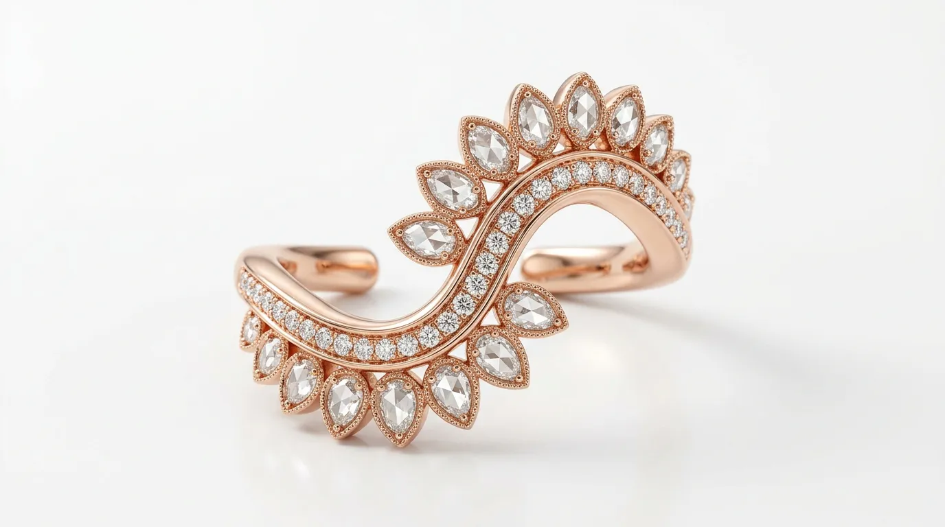
It’s tempting to think of the background as an afterthough something you deal with after the lighting and the styling are sorted. In reality, the background for jewelry photography shapes almost everything else in the shot. It sets the mood, controls contrast, and decides whether the viewer’s eye lands on the jewelry or gets distracted by something in the frame.
Jewelry photography is unlike photographing clothing or furniture. The subject is tiny, often under a few centimeters, and it relies entirely on light, reflection, and contrast to read as valuable. A background that fights with those reflections, or that doesn’t offer enough contrast against metal and stone, will flatten the piece and rob it of its sparkle. Get the background right, and even a modest jewelry product photography setup can produce images that look like they came from a high-end catalog.
Creates a Professional Look
A clean, well-chosen backdrop instantly signals that a brand takes its presentation seriously. Shoppers browsing Etsy or Amazon make snap judgments within seconds, and a polished background is often the first thing that separates a professional listing from an amateur one. Consistency in tone, color, and lighting across your background choices tells the customer that what they see is what they’ll get.
Improves Customer Trust
Online shoppers can’t touch the product before buying, so they lean heavily on visual cues to judge quality. A distracting or poorly lit background creates doubt even subconsciously about whether the seller is established or trustworthy. A thoughtful background, on the other hand, builds confidence before the customer even reads the product description.
Makes Jewelry Shine
Because jewelry photography is about capturing light, reflection, and fine detail, the backdrop has to support rather than compete with those qualities. The right background enhances contrast around metal edges, lets gemstones catch and throw light naturally, and keeps the viewer’s focus exactly where it belongs.
Increases Ecommerce Sales
Product images are one of the strongest conversion factors in ecommerce. Studies and marketplace data consistently show that clear, high-contrast, well-lit photos outperform cluttered or dim ones in click-through and purchase rates. A strategic background for jewelry photography isn’t just an aesthetic decision, it’s a sales tool.
Supports Brand Identity
Beyond individual listings, your background choices contribute to how your brand feels as a whole. A minimalist white backdrop suggests a modern, accessible brand. A rich black background paired with dramatic lighting suggests luxury. Fabric or wood tells a story of craftsmanship and warmth. Choosing a background style and sticking with it across your catalog reinforces recognition and trust over time.
How to Choose the Best Background for Jewelry Photography
There’s no single best background for jewelry photography that works for every brand or every product. The right choice depends on the piece itself, your brand identity, your audience, and where you’re planning to sell. Here’s how to think through the decision.
Consider Jewelry Color
Metal tone and gemstone color play a huge role in how a background reads. Gold jewelry, for instance, tends to pop dramatically against a black or dark backdrop, while silver or platinum pieces often look cleaner against gray or white. Pale gemstones like pearls or opals can get lost on a white background but stand out beautifully against beige or soft neutral tones.
Match Your Brand Style
Think about the personality your brand is trying to project. A streetwear-inspired jewelry line might use bold colors or textured surfaces, while a bridal or fine jewelry brand almost always leans toward clean, minimal, or elegant backdrops. Your background should feel like a natural extension of your logo, packaging, and overall visual identity, not something chosen at random for a single shoot.
Think About Your Target Audience
A younger, trend-driven audience often responds well to creative, colorful, or lifestyle-oriented backgrounds, while a more traditional or luxury-focused customer base tends to prefer understated, classic settings. Understanding who you’re photographing for helps narrow down which of the ten background ideas below will resonate most.
Choose Background Based on Marketplace
Different platforms have different expectations, and it pays to know them before you shoot.
Amazon: Amazon has strict main-image requirements, typically demanding a pure white background for the primary product photo, with more creative backgrounds allowed in secondary images.
Etsy: Etsy gives sellers far more creative freedom, which is why handmade or vintage-style jewelry sellers often use wood, fabric, or textured backgrounds to convey a handcrafted feel.
Shopify: Shopify stores, since they’re self-hosted, allow full control. Many brands use a mix of clean studio shots and lifestyle or gradient backgrounds to balance professionalism with personality.
10 Best Jewelry Photography Background Ideas
Now that you understand why background choice matters and how to think about it strategically, let’s look at ten proven jewelry photography background ideas, along with when and why to use each one.
1. White Background for Jewelry Photography
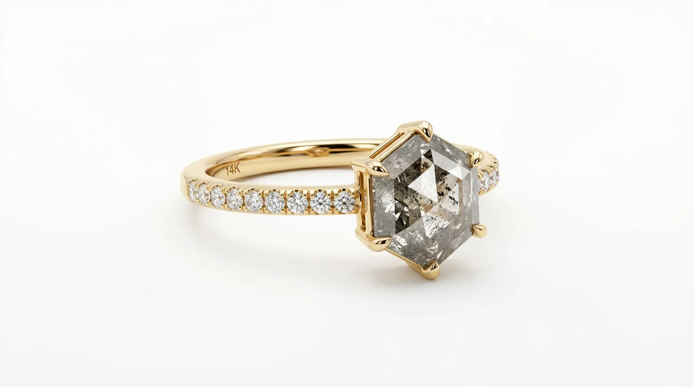
A pure white background remains the gold standard for ecommerce jewelry photography, especially for Amazon listings, which often require it for main product images. It’s clean, distraction-free, and puts full attention on the piece itself. White backdrops also tend to be minimalist, making them ideal for brands that want a modern, no-nonsense look. Because it removes any color bias, white is widely credited with driving high conversion rates, since shoppers can judge the true color and finish of the jewelry without interference.
Achieving a true, seamless white rather than a dull gray-white. Usually requires either a lightbox with diffused lighting from multiple angles or careful post-production work to lift the background to pure RGB white without blowing out detail on the jewelry itself. Many sellers shoot on a white acrylic sweep, which also creates a soft, natural reflection beneath the piece, adding a touch of realism that a flat paper backdrop can’t replicate.
2. Black Background
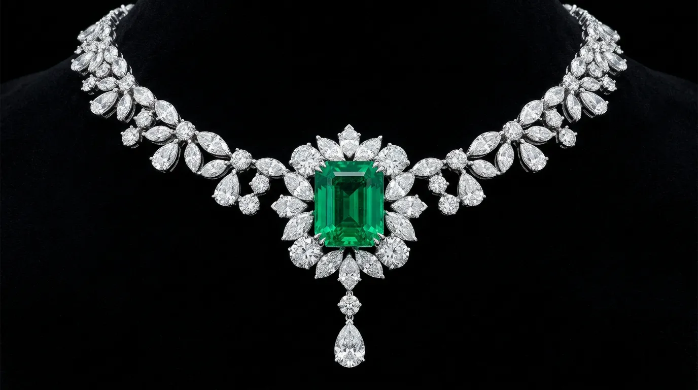
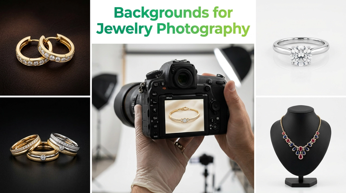
If white is about clarity, black is about drama. A black backdrop instantly signals luxury, which is why it’s a favorite for high-end pieces. It’s especially effective for diamond jewelry and faceted gemstones, since the dark background makes sparkle and light reflections far more visible. Overall, black delivers a premium feel that resonates strongly with fine jewelry and bridal collections.
The trickiest part of shooting on black is avoiding a “muddy” look, where reflections and highlights get lost in the darkness. Professionals often use a black glass or acrylic surface combined with a single strong light source and a reflector to bounce just enough fill light back onto the piece. This keeps the background rich and deep while still preserving the fine detail and sparkle that make black-background shots feel premium rather than flat.
3. Gray Background
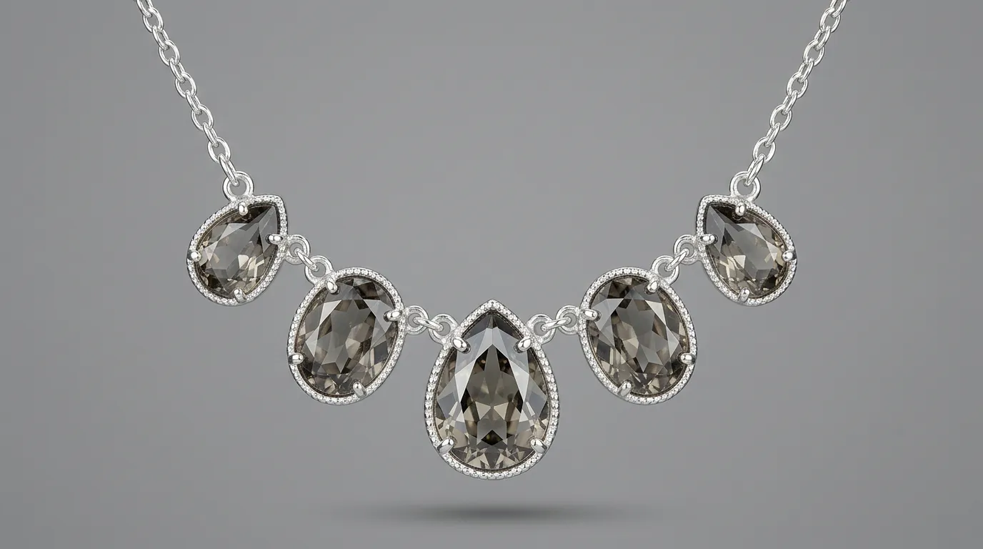
Gray sits comfortably between white and black, offering a neutral tone that doesn’t compete with any particular metal or gemstone color. It provides balanced contrast, making it a safe, versatile choice for brands selling a wide range of jewelry types, especially silver and platinum pieces that can sometimes disappear against pure white.
A mid-tone gray backdrop is also forgiving for photographers who are still refining their lighting setup, since it hides small inconsistencies that would be far more obvious against pure white or pure black. For catalogs that include a wide mix of gold, silver, and gemstone pieces, gray can serve as a single “house background” that works reasonably well across the whole range without needing to switch setups for every product.
4. Mannequin Background
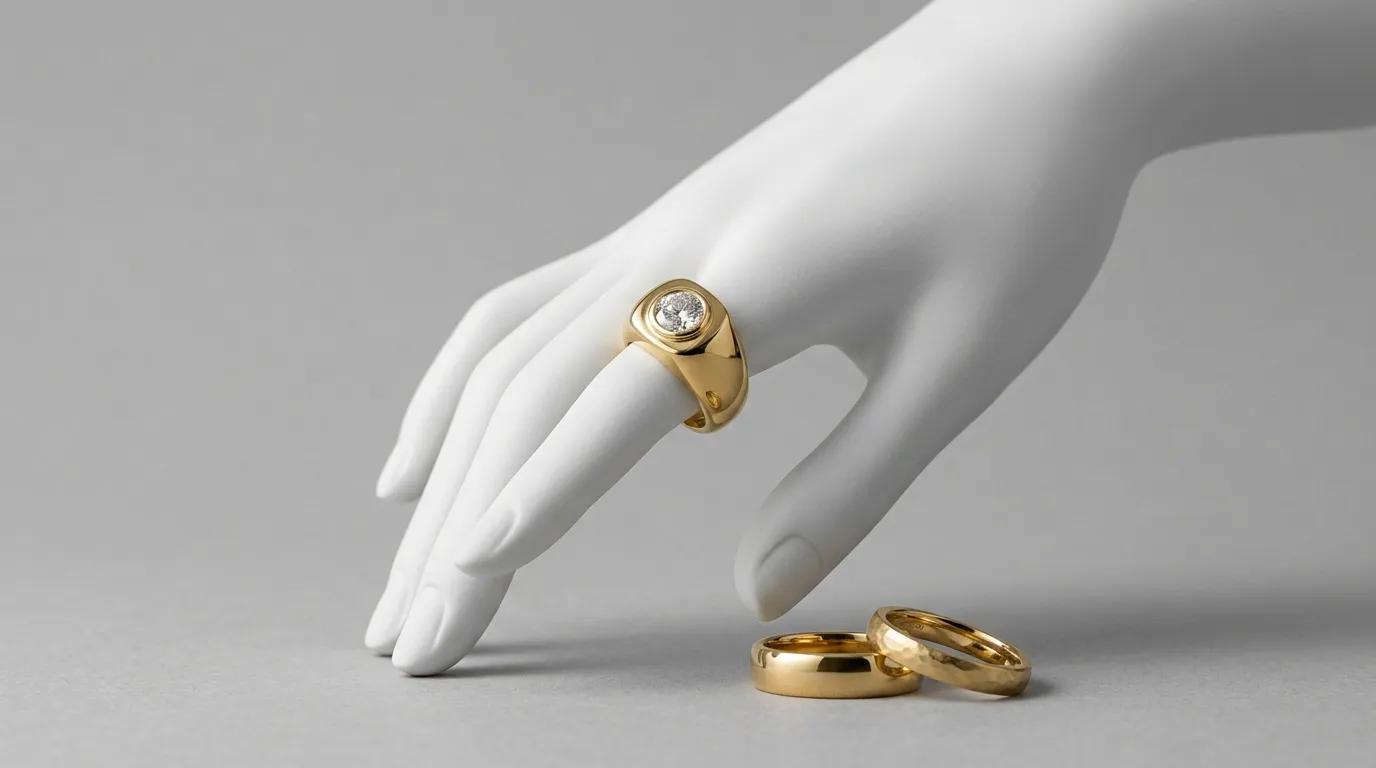
Using a jewelry mannequin whether a bust for necklaces or a hand form for rings adds a sense of scale that flat-lay photography can’t always convey. It helps shoppers picture how a piece will actually sit and move, which supports a stronger sense of wearability. Many brands use mannequin shots as secondary images to complement flat product photos and give a more lifestyle-oriented view.
5. Gradient Background
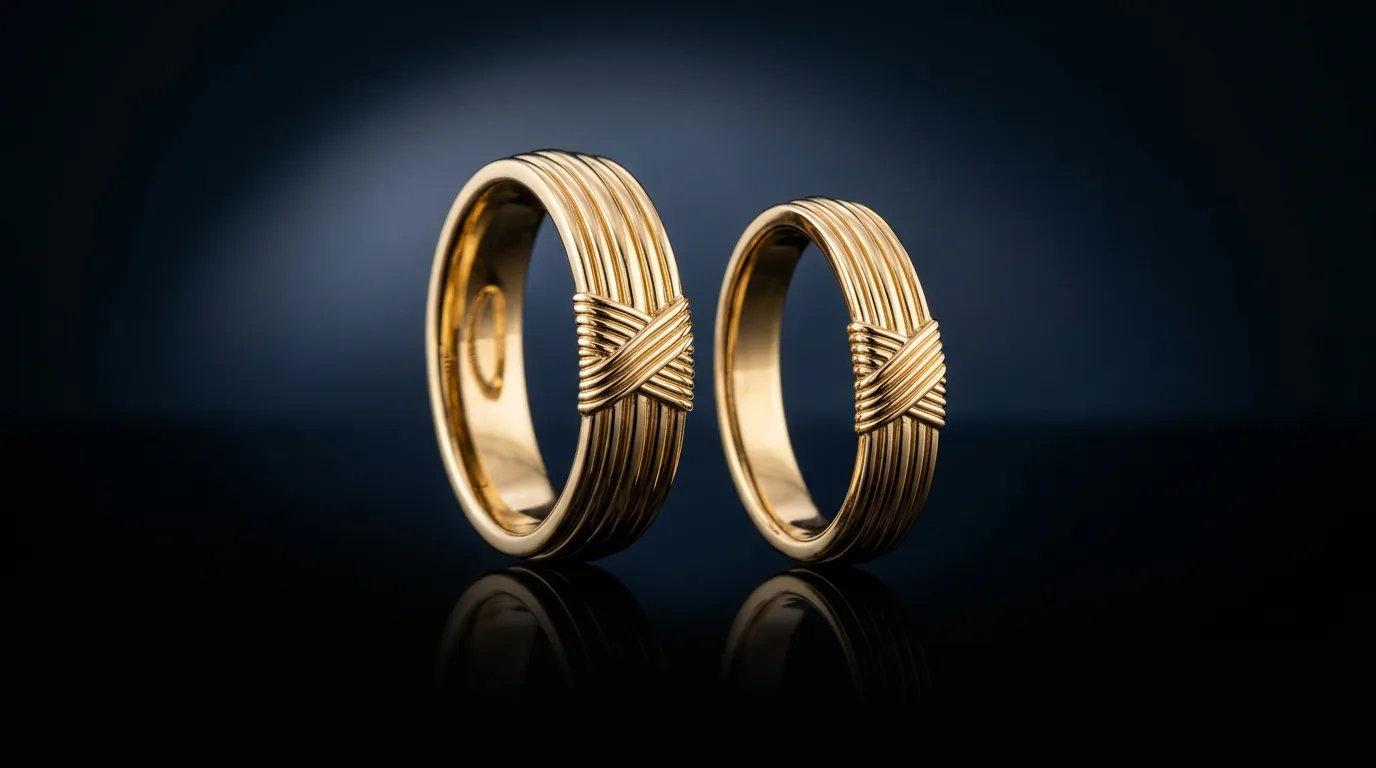
A gradient backdrop, moving smoothly from one tone to another, adds visual depth without introducing distracting elements. It has a modern feel that works particularly well for contemporary jewelry lines, and it offers plenty of room for creative expression through color choices. Because gradients can be tailored to feel soft or bold, they’re increasingly popular for luxury branding in digital campaigns and social media content.
6. Textured Background++
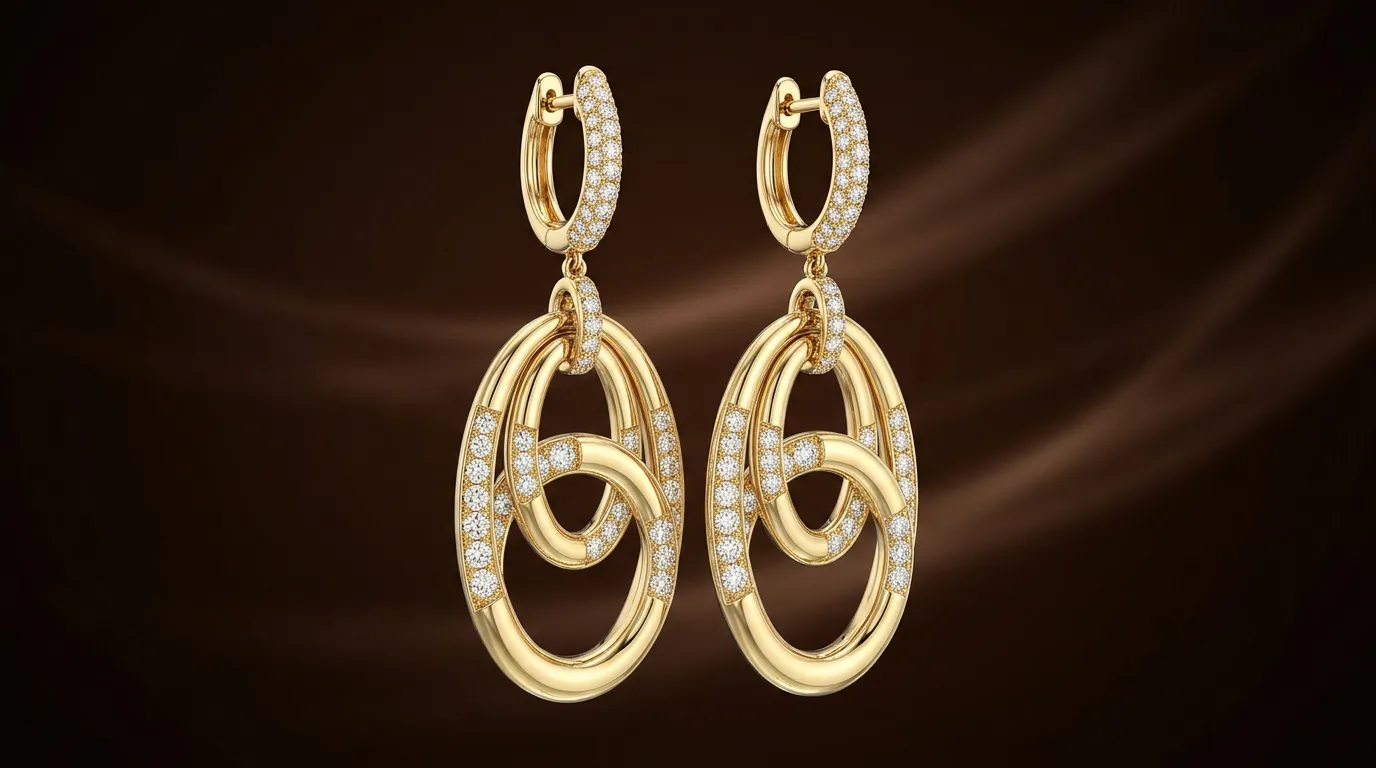
Textured surfaces think linen, stone, or raw paper bring warmth and character into a shot. This style is especially suited to handmade jewelry, where the imperfections and craftsmanship deserve a backdrop that feels equally authentic. Textured backgrounds also lean into a vintage aesthetic and give images a more natural look compared to sleek studio setups.
7. Product Packaging Background
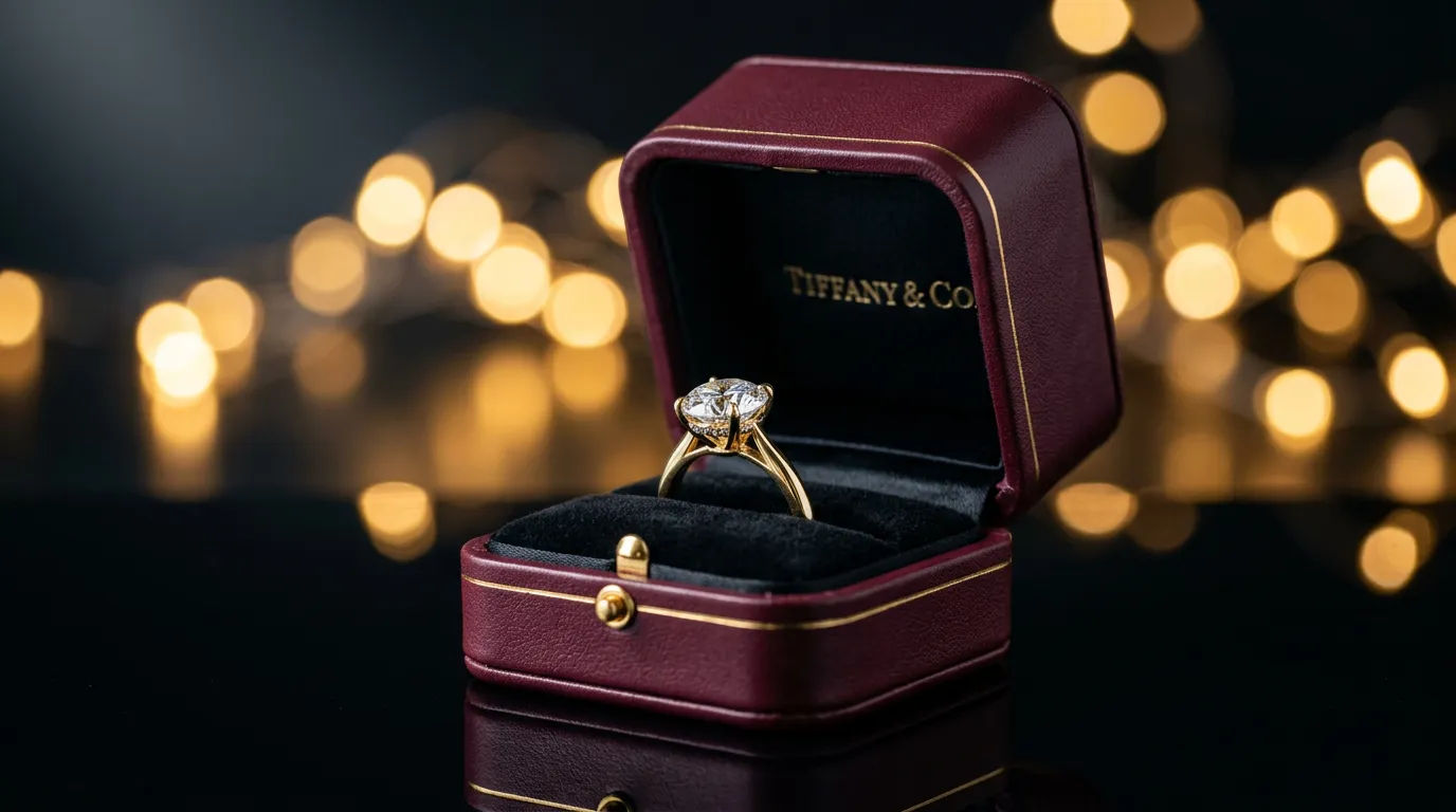
Photographing jewelry alongside its packaging a branded box, pouch, or ribbon creates an image that feels like a gift. This approach is powerful for building a sense of luxury experience around the unboxing moment, and it reinforces brand identity by showing customers exactly what they’ll receive, not just the jewelry itself.
8. Fabric or Cloth Background
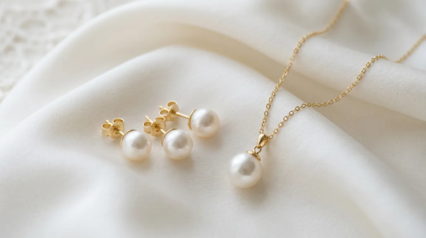
Draped velvet, silk, or linen fabric adds a soft, tactile quality to jewelry photos. It’s a classic choice for brands that want an elegant presentation without going fully minimal. Fabric backgrounds also lend themselves well to fashion style shoots, where jewelry is presented as part of a broader outfit or aesthetic story.
9. Bokeh Background
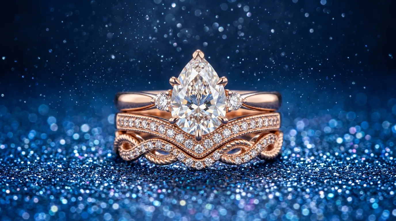
A blurred, softly lit bokeh background often created with fairy lights or reflective surfaces out of focus is one of the most effective ways to emphasize sparkle. It’s particularly striking for gemstone jewelry, where the soft glowing dots in the background echo the light dancing off facets. This style consistently reads as luxury and works beautifully for holiday or gift-guide campaigns.
10. Wooden Background
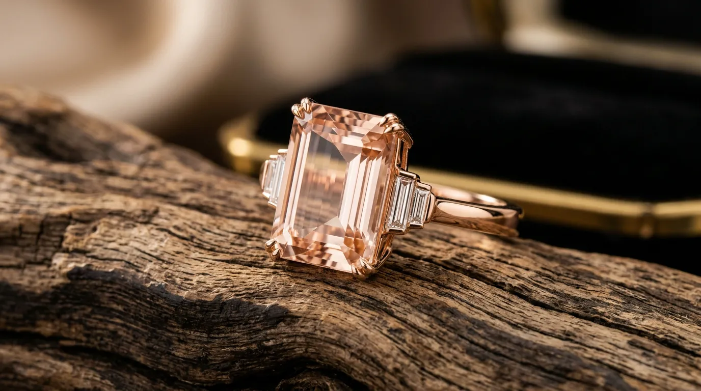
A natural wood surface brings a rustic, grounded feel to jewelry photography. It pairs especially well with boho-inspired designs and earthy gemstones like turquoise or amber. Wood backgrounds also suit natural jewelry made from organic materials, giving the whole image a warm, artisanal quality.
Common Background Mistakes in Jewelry Photography
Even with the best intentions, it’s easy to undermine great jewelry with the wrong background choices. Here are the mistakes that show up most often, and why they hurt your images.
Using Busy Backgrounds: A background with too many patterns, colors, or objects pulls attention away from the jewelry itself. The eye should land on the product first, not on a distracting print or cluttered surface behind it.
Poor Contrast: When a background is too close in tone to the jewelry like silver on white, or pale gold on beige the piece can blend in and lose definition. Choosing a background for jewelry photography with the right contrast is essential for making details visible.
Wrong Colors: Background colors that clash with the metal or gemstone can distort how the piece actually looks, misleading customers about the true color and potentially increasing returns.
Distracting Props: Adding too many props flowers, leaves, extra jewelry, decorative items can turn a product shot into a lifestyle scene that no longer clearly showcases the item for sale.
Low Quality Editing: Poor cropping, uneven color correction, or visible background seams from cutouts can make even a well-composed shot look unfinished and unprofessional.
Beyond these individual mistakes, there’s a broader pattern worth watching for: inconsistency across a catalog. It’s common for sellers to shoot new products in batches over time. Sometimes months apart, using slightly different lighting, camera settings, or backdrop shades each time. Individually, none of these shots look bad but placed side by side on a storefront. The inconsistency becomes obvious and makes the brand feel disorganized. Building a simple, repeatable checklist for background color, lighting angle, and camera distance before every shoot goes a long way toward avoiding this problem.
Background for Jewelry Photography vs Digital Background Replacement
Not every brand has access to a full studio, and that’s where digital tools come in. Many sellers now shoot jewelry against a simple, controlled backdrop and rely on background removal afterward to swap in whatever setting fits the platform or campaign.
This approach has real advantages: a single photoshoot can generate images for Amazon’s white-background requirement, Etsy’s more decorative style, and Instagram’s lifestyle content, all without re-shooting. However, digital replacement still depends on strong original photography. If the lighting, shadows, and reflections aren’t captured correctly on set, no amount of jewelry photo editing can fully recover a natural, believable look.
That’s why many professional workflows combine both: a physical background chosen thoughtfully during the shoot, followed by jewelry retouching to fine-tune color accuracy, remove dust or scratches, and ensure every image in a catalog looks consistent, whether it was shot last week or six months ago.
Which Background Works Best for Different Jewelry?
| Jewelry | Recommended Background |
|---|---|
| Diamond Ring | White / Black |
| Gold Necklace | Black |
| Silver Jewelry | Gray |
| Pearl Jewelry | Beige |
| Handmade Jewelry | Wood |
| Luxury Jewelry | Gradient |
| Fashion Jewelry | Fabric |
This isn’t a rigid rulebook, it’s a starting point. Feel free to test a couple of backgrounds for your bestsellers and see which one drives more clicks or add-to-carts before committing across your whole catalog.
Pro Tips for Better Jewelry Photography Backgrounds
Lighting: Soft, diffused lighting is almost always better than harsh direct light for jewelry. A lightbox, softbox, or even a well-placed window with a diffuser sheet can dramatically improve how your background and product interact.
Reflections: Reflective surfaces like glass or acrylic backgrounds can add elegance, but they need to be controlled carefully. Watch for unwanted reflections of your camera, lights, or room in polished metal. A small change in angle can fix this instantly.
Shadows: A subtle, soft shadow beneath the jewelry adds realism and grounds the product in the frame. Completely flat, shadowless images can look artificial, while harsh shadows can look cluttered, aim for something soft and natural.
Editing: Post-processing should enhance, not overcorrect. Adjust white balance, clean up any dust or fingerprints on the jewelry, and make sure the background tone stays consistent across your product line.
Consistency: Perhaps the most overlooked tip: use the same background style, lighting setup, and angle across your entire catalog wherever possible. Consistency builds trust and makes your store feel curated rather than thrown together.
It’s also worth keeping a simple reference file. A photo of your setup, the exact backdrop color code, and your camera settings. So that any future shoot, whether done by you or a hired photographer, can match the existing catalog exactly. This small bit of documentation saves hours of retroactive editing later and keeps your product photography looking like it came from one cohesive brand, even as your catalog grows.
FAQs
What is the best background for jewelry photography?
There isn’t one universal answer, but white and black are the two most versatile choices. White works well for clean, ecommerce-standard shots, especially on Amazon, while black suits luxury and diamond pieces that benefit from dramatic contrast.
Which color background is best for gold jewelry?
Black backgrounds tend to make gold jewelry pop the most, since the warm tone of the metal contrasts strongly against the dark backdrop, emphasizing shine and detail.
What are the best jewelry photography background ideas for ecommerce?
White, gray, gradient, and fabric backgrounds are among the most popular jewelry photography background ideas for ecommerce, since they balance professionalism with enough personality to reflect a brand’s identity.
Should I use a white or black background?
It depends on the piece and the platform. White is generally required or preferred for Amazon main images and works well for everyday, minimalist branding. Black suits luxury positioning and pieces with strong sparkle, like diamonds.
Can I change the background during photo editing?
Yes. Background removal and replacement are common in jewelry photo editing workflows, allowing sellers to reuse the same shoot across multiple platforms with different background requirements.
How do professionals create jewelry photography backgrounds?
Professionals typically combine controlled studio lighting, carefully selected physical backdrops (like acrylic, fabric, or wood), and post-production retouching to achieve a clean, consistent, and market-ready final image.
Final Thought
Choosing the right background might sound like a small detail, but when it comes to jewelry photography, it’s actually a game-changer. If you’re selling on Amazon, a white background is the safe choice. Want a luxury vibe? Black backgrounds nail it. And if you’re working with handmade pieces, a wooden surface gives that cozy, warm feel. Whichever one you go with, the goal stays the same: let the jewelry speak for itself and make customers trust what they see.
Try out a few styles, see which one fits your brand best, and stick with it. That consistency is what makes a real difference in sales over time.
And if editing all these photos yourself feels like a hassle, professional jewelry photo editing can take that off your hands clean, consistent, high-converting images, no hassle involved.
Are your product photos looking inconsistent? Contact us for a free consultation, or Get a Free Quote and see how professional retouching can transform your listings.